


Visiting MAMbo (Musem and Contemporary Art Bologna)
- Madeleina Kay

- Apr 22, 2024
- 6 min read
I didn’t have much time free in Bologna, but I really wanted to see MAMbo (Modern and Contemporary Art Bologna). They had a temporary exhibition as well as their permanent collection on display.
The theme of the permanent collection engaged me, ‘The exhibition project for the permanent collection explores the link between action and the creation of subjectivity, proposing a reflection on identity through the theme of identification: a dynamic, continuous, and infinite process of self-construction’. A lot of the work was overtly LGBTQ+ and feminist content, whereas other work seemed more tangentially related to the theme.

For example, I rather liked this ‘New-DADA and Nouveau Realisme’ tempera on canvas painting, ‘Grande Spettacolo Ortogonale’, 1963 by Concetto Pozatti. However, I struggled to see how it fitted the ‘identification’ theme. The description did not provide any enlightenment; ‘recurring forms and archetypal elements, that in their complex dialectic, float in the profundity of pictorial space’. Art waffle at its best.

In contrast, artworks like this photographic print, ‘vb26.021.ali’, 1997, of a performance by Vanessa Beecroft was quite obviously exploring sexuality and gender identity; ‘her art explores the problems of depicting the female universe in contemporary Western society’. The artwork was prompted by an advertising campaign for pantyhose which the artist saw on display at a Milan department store. The monochrome image, ‘homologation’ of the female models and the way their ’eyes never meet the viewer’s gaze’ – depersonalise them and strip them of their identity.

Another great artwork, with a similar theme was this inflatable rubber skirt and accompanying video of the artist wearing this impractical garment, trying (and failing) to board a train. I annoyingly forgot to take a photo of the plaque for reference, so I can’t remember the artist or title of the artwork – but the description explained how the garment prevented her from escaping her lived reality. In the way that many social expectations of women’s appearances can limit their lives – forcing them to waste time on manicuring or wasting money on buying beauty products or fashion items, some of which (ie. high-heeled shoes, fish-tail skirts) can significantly limit their mobility. I am certainly guilty of spending too much time dyeing / straightening my hair, applying make-up and styling outfits which sometimes feels like an obligation I am pressured into because I don’t like to appear in public in my “natural” state (especially since I am often photographed at the events which I attend).

I particularly liked this embroidered tapestry, ‘Homage to the Hollywood Squares (Featuring Bridget Riley)’, 2008 by Francesco Vezzoli. The description explained how Vezzoli ‘has reprocessed the contemporary visual imagery with an ironic, allusive language, moving between the entertainment world’s glamorous seductions and popular culture’s stereotypes’. The abstract imagery felt very conceptual – I couldn’t have deduced this intended meaning without the text description, but nonetheless I felt the visual was impactful.

I particularly liked that he had left the threaded needle attached to the border of the artwork – a little signifier that the image is entirely constructed much like the glamour of Hollywood celebrity.

Another artwork I really liked was ‘Sleeping’, 1991 by Gilbert and George because of the way the soles of their shoes had been coloured to give the impression of religious imagery / stained glass windows, congruous with the graveyard setting, although contrasting with the monochrome colour scheme. The description explained how, ‘the duo has conceived of themselves as a single entity since their first meeting in 1969. Since that time, they have fostered the principle of Art for All. A belief in the emancipatory power of art has driven them to develop a clear and simple visual language that calls into question common sets of problems like identity, sexuality, politics and religion.’ I’m really glad I saw this artwork because I think their work could be highly relevant to my research interests.

I’m not a massive fan of marble sculpture, but this piece, titled ‘Untitled’, 2010-2021 by Lynda Benglis was stunning. A mesmerizingly allusive form that resembled a sea creature X a flower X knotted fabric. The lack of title of any additional description left my understanding of the piece suitably vague – nevertheless I appreciated its artistry.

I love anything with bright, bold colours – so I was immediately drawn to this sculpture, ‘I am a Rainbow Too’, 2004 by Paolo Pivi. ‘A neat collection of thousands of coloured paper ribbons’ which reminded me of the paper strips I used to make paper chains every Christmas when I was a child. The description explained how the artwork was ‘a systematic juxtaposition and superimposition of elements, transforming synthesis and accumulation into an energy catalyst’. I loved how the visual elements merged closer together as you walked around the sculpture, depending on your perspective.


Another sculpture which I really enjoyed was ‘Strategie’, 1990 by Maurizio Cattelan. Who made this ‘provocative entry into the art world’, a construction consisting of ‘fifteen copies of the magazine “Flash Art” like a house of cards, constituting a barbed metaphor of the roles and rules for the contemporary art establishment’s game embodied in a pyramidal structure that uses one of its most effective tools of section and power as an essential element.’ Just like Duchamp’s urinal which I saw exhibited in Rome, I love any artwork which critiques the structures which govern the art establishment from within.

My favourite artwork in the exhibition was so big (nearly 10 metres) that I couldn’t capture it in its entirety in a single photograph. An oil on canvas painting, titled ‘Il Teorema di Pitagora’, 1960-61. ‘The solid, three-dimensional figures of the canvas are articulated. They chase each other and transform into a creative and “illogical” narrative vortex that subverts all symmetry. It openly contrasts with society’s tendencies for hierarchy and order, according to the character and ideals of the artist himself’. The texture of the brushwork was incredible, I also loved the subtle but vibrant colour palette. There was so much dynamic energy, chaos and motion in the painting – it's the kind of artwork you could stare at for hours and keep noticing new things.


In contrast, this more minimalist sculpture also captured my attention. A black boat filled with red colour pigment. ‘Senza Titolo’, 1998 by Claudio Parmiggiani. The description made a thought-provoking questions, ‘What is a boat if not the mirror of a departure, a voice leaving, an extreme farewell, a presence that becomes a shadow in the distance?’ As someone that makes so many journeys, and often feels like I am in a transient state more often than not, I found this romanticised image very engaging.

I was also a big fan of this communist artwork, ‘Funerali di Togliatti’, 1972 by Renatto Guttuso, a mixed media collage and acrylic painting. I don’t just like it because it includes flags, but because the sense of community, belonging and empowerment in this artwork are palpable, ‘It is not a conventional commemorative portrait of a leader rather the portrait of a community and its ideal reference points, embodied by the many politicians and intellectuals from Italian and communist Italian history mixing with the crowd’.

It came with a helpful key to identify the attendees in the crowd. The media, style and execution of the artwork are also quite unusual.

There was also a Keith Harring artwork in the permanent exhibition, and I don’t know why but every time I see his artwork it annoys me a little bit more.

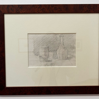
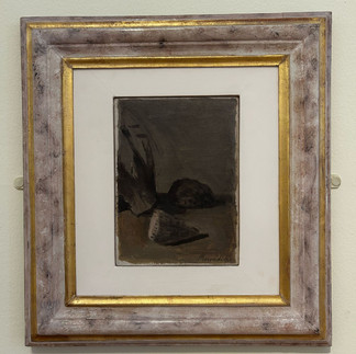
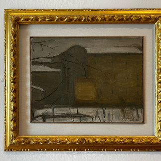
There was also a huge collection of artworks by a single artist, ‘Giorgio Morandi’, who lived and worked in Bologna for most of his life, with several rooms dedicated to his sketches and paintings. The description explained how he had become ‘Professor of Renaissance Art at the University of Bologna’ where he was apparently recognised as ‘the greatest living painter in Italy’. After these grandiose claims, I can only describe my impression of his artwork as ‘disappointing’. I didn’t get the hype and in many instances I considered the frames to be far more interesting that the artworks themselves. But maybe I am uncultured.


I also struggled to engage with the temporary exhibition - which featured industrialesque sculptures. I'm still not very good at "reading" sculptures and I found these particularly dull and difficult to engage with on any meaningful level. It also didn't help that the pungent smell of silicone was making me feel nauseous.


Comments